

Small House, Big Impact
Smart Design Ideas That Maximize Space
[How to make your Dutch home feel twice the size]
Living in a compact space—whether it’s a historic Haarlem apartment or a modern Amsterdam studio—doesn’t mean compromising on luxury. In the Netherlands, we are masters of the "compact footprint." The secret to a successful small home isn't just about fitting things in; it’s about using architectural cleverness to change how the space feels.
At Atelier Niris, we believe that good design is about quality, not just quantity. Here is how we maximize every square centimetre.
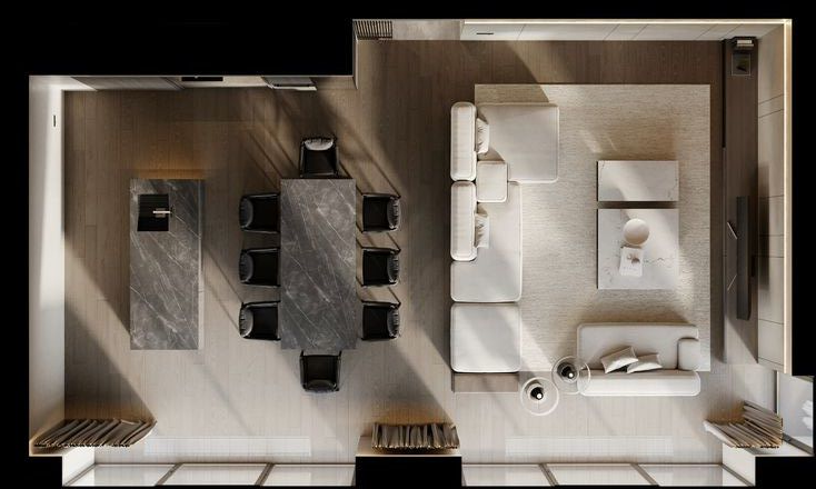
1. Radical Spatial Planning
[Moving from "living in a box" to "living in a flow"]
In a small home, traditional "rooms" are often your worst enemy. To truly maximize a small Dutch home, you have to move beyond "decorating" and start re-engineering the floor plan. Every wall you remove adds visual depth and light.
Spatial planning is the architect’s most powerful tool—it’s about changing the DNA of the apartment to create efficiency where there was once clutter. At Atelier Niris, we approach spatial planning not by asking where the furniture goes, but by asking how we can eliminate "wasted" space. Here are some ways spatial planning can be done effectively:
1a. The "Core" Method: Clustering the Chaos
Most small apartments suffer because utilities (the bathroom, utility) are scattered. This creates multiple "dead zones" around pipes and walls.
The Solution: We pull all these technical functions into a single central core. By clustering the "heavy" elements in the middle of the floor plan, we keep the center "busy" but leave the entire perimeter—where the windows and views are—completely open and free for living, sleeping, and dining.
1b. Dissolving the Hallway: The Functional Spine
Traditional hallways often eat up 10% of a home’s square footage just for walking.
How it works: We turn the hallway into a functional corridor. One side might become a floor-to-ceiling wardrobe, while the other opens into the kitchen. By removing the wall between the hall and the living area, the entire depth of the house becomes visible the moment you step inside.

1c. Zoning Without Walls
The fastest way to make a small home feel tiny is to put a door on every room. Instead, we use visual dividers to define areas without blocking the eye.
How it works: We create borders using changes in materials—like a shift from warm oak flooring in the living area to a sleek tile in the kitchen. This tells your brain you’ve entered a "new" room, even though there is no physical wall.

1d. The Vertical Revolution: Mezzanines & Levels
In small studios, the floor is your most precious resource. When you can’t expand the footprint, you must look at the "airspace." Adding a mezzanine—an intermediate level that doesn’t cover the whole floor—is the most dramatic way to optimize spatial planning. A mezzanine creates a psychological and physical separation between "active" and "rest" zones.
The Sleeping Loft: By moving the bed to an elevated platform, you reclaim the 4–6m² it usually occupies on the ground. This leaves the lower level entirely free for a much larger living or dining area.
The "Core" Integration: We often place the "heavy" functions—like the bathroom or kitchen—underneath the mezzanine. This stacks the utilities in one corner, leaving the rest of the studio open.
1e. The "Long Sightline" Rule
The Long Sightline Rule is an architectural technique used to trick the human brain into perceiving a space as larger than its actual square footage. In a small Dutch apartment, your eyes are your best tool for creating a sense of "airiness." The longest distance in any rectangular room isn't from wall to wall—it’s from corner to corner. We plan layouts so that when you enter a room, your eye is immediately drawn to the furthest diagonal point. By keeping this path clear of bulky furniture or partitions, the room feels like it has more "volume" because the eye has a longer distance to travel before hitting a boundary.
1f. Connecting to the Outside
A sightline shouldn't stop at your window. We align interior corridors and doorways so that they point directly toward a window or a balcony door. This "borrows" the space from the outside. When you can see the sky or the street from the middle of your home, the walls feel less restrictive, and the apartment feels like it is part of a much larger environment.

1g. The "Uninterrupted" Floor
One of the most effective ways to maintain a long sightline is to keep the floor clear. We often use wall-mounted (floating) cabinetry and "leggy" furniture rather than heavy, blocky pieces that sit flat on the ground. When you can see the floor extend all the way to the base of the far wall, your brain registers that the space is continuous and open.

2. Intelligent Storage Integration
[Turning the "dead" zones into high-performance space]
In a small home, storage shouldn't be an afterthought—it should be part of the architecture itself. When storage is planned into the "bones" of the house, it disappears, leaving the living areas calm and clutter-free.
2a. The "Full-Height" Rule
Standard, freestanding wardrobes often stop 30cm short of the ceiling. This is "dead space" that collects dust and creates visual clutter.
The Strategy: Always design floor-to-ceiling cabinetry. By extending the storage to the very top, you gain a massive amount of "upper tier" space for seasonal items (suitcases, winter coats) while drawing the eye upward, which makes the room feel taller.
2b. Built-in "Niches"
Freestanding bookshelves and spice racks "protrude" into your walking space, making rooms feel narrower.
The Strategy: During the spatial planning phase, we identify non-load-bearing walls where we can carve out recessed niches. Whether it’s for shampoo in the shower, spices in the kitchen, or books by the bed, these "in-wall" solutions provide storage without stealing a single centimetre of floor area.

2c. Activating the "Hidden Voids"
Every home has hidden cavities that are usually boarded up. Micro-planning activates these "dark" spaces:
Under-Stair Engineering: Instead of one dark closet under the stairs, we design a series of pull-out "apothecary" drawers. This allows you to see everything at a glance and utilizes the full depth of the staircase.
Plinth Drawers: The 10–15cm space under your kitchen cabinets (the kickboard) is perfect for flat items like baking trays, extra floor tiles, or even a hidden step-stool.

2d. Point-of-Use Storage
Clutter happens when it’s too difficult to put something away.
The Strategy: We plan storage exactly where the action happens. This means a charging drawer in the kitchen island for phones, a recessed key-drop at the front door, and an appliance garage with internal power so your kettle and toaster are hidden but always ready to use.

2e. The "Floating" Effect
Storage that sits flat on the floor can make a room feel "clamped down."
The Strategy: Whenever possible, we wall-mount (float) our storage units. When you can see the floor extend all the way to the wall underneath a cabinet, your brain registers the space as being open and continuous, even if there is a storage unit above it.
3. Seamless Architectural Flow
Here are the key points to achieving a seamless, high-impact design:

3a. Sliding over Swinging
A traditional swinging door is a "space-thief"—it requires about 1 to 1.5 square metres of clear floor space just to function.
Pocket Doors: These slide into a cavity in the wall, disappearing completely when open. This allows you to place furniture right up to the doorway and keeps the sightline open.
Sliding Partitions: Instead of a wall with a door, use a large sliding panel. It allows a room to be "private" one minute and part of a giant open-plan space the next.
3b. Camouflaged Cabinetry
Large closets can feel like "heavy" blocks in a small room. In tight quarters, traditional handles are "visual clutter" and physical obstacles that can catch on clothing.
Push-to-Open Tech: Using "tip-on" or "push-to-open" mechanisms allows cabinet doors to be perfectly flat.
The "Wall" Effect: When you remove handles, a row of closets looks like a clean architectural wall rather than a piece of furniture. This "quiets" the room significantly.

3c. Flush Transitions
Standard homes often have "lips" or thresholds between the hallway, bathroom, and living room.
Continuous Flooring: By keeping the floor at the exact same level throughout the home—with no transition strips—the eye perceives the entire apartment as one single, expansive surface.
Flush Skirting: Instead of baseboards that sit on the wall, we use recessed skirting. The wall and the baseboard meet at a perfectly flush line, eliminating a ledge that collects dust and breaks the vertical line of the wall.
3d. Integrated "Shadow Gaps"
Instead of using bulky moldings or cornices to hide the gap where the wall meets the ceiling, we use a shadow gap (a small, intentional recess).
Visual Lightness: This makes the ceiling look like it is "hovering" above the walls. It hides structural movements and creates a sharp, clean line that feels modern and intentional.
3e. Concealed "Technical" Elements
A seamless home hides the "machinery" of living.
Hidden Curtain Tracks: We "pocket" the curtain tracks into the ceiling so the fabric appears to fall directly out of the architecture.
Integrated Lighting: Instead of hanging fixtures, we use plaster-in LED profiles. These sit flush with the ceiling or wall, providing light without any visible "lamp" body.
Disappearing Outlets: Using "pop-up" outlets on kitchen islands or hiding sockets inside drawers ensures that beautiful stone or wood backsplashes remain uninterrupted.

3f. Frameless Geometry
Traditional windows and doors have bulky frames that act as a "border" around your view.
Frameless Glass: Whenever possible, we use slim-profile or frameless glass systems. This removes the "frame" from your sightline, merging the interior of your home seamlessly with the view outside.
Strategic Note:
Seamless design isn't just about looks; it's about fluidity. When you remove the thresholds, handles, and frames, you remove the "stumbling blocks" of a small home, making the daily experience feel effortless and high-end.

4. Reclaiming Edges and Corners
[Turning "dead" corners into functional destinations]
To truly maximize the impact of a small home, every "edge" should be intentional. Utilizing the spaces under windows or in awkward alcoves not only saves floor area but creates those high-end, cozy moments that make a house feel like a home.
4a. Integrated bench seating
The space directly under a window is often left empty to allow for radiator heat or simply because standard furniture doesn't fit. However, this is the most valuable "real estate" for light. By building a custom bench directly under the window—especially in a bedroom or dining nook—you eliminate the need for bulky chairs.

4b. The "Deep-Sill" Effect
If the walls are thick enough, extending the windowsill into a deep wooden ledge creates an instant reading perch. This keeps the center of the room open while providing a place to retreat.
4c. Hidden Storage Below
These benches are perfect "micro-planning" opportunities. The base can be designed as a series of deep drawers for extra bedding or books, turning a "viewing spot" into a high-capacity storage unit.
4d. The "Between-Wardrobes" Nook
When designing a wall of floor-to-ceiling cabinetry, we often leave a central 1.2-meter gap. By lining this gap with warm wood and adding a built-in cushion and a small spotlight, we create a private sanctuary that is literally "inside" the storage wall.

Strategic Note:
These "nooks" are about psychological space. In a small home, having a dedicated place to sit that isn't the sofa or the bed makes the apartment feel like it has multiple "destinations," which significantly increases the perceived size and luxury of the home.
5. Smart Agile Furniture Design
In a small home, furniture should be flexible and "quiet." Agile design focuses on pieces that serve multiple purposes while maintaining a minimal visual footprint to prevent the home from feeling over-furnished.

5a. The "Swiss Army Knife" Approach
Look for pieces that can transform based on the time of day.
The Transformative Kitchen Island: A kitchen island can serve as more than just a prep station. By incorporating cantilevered tops or extendable surfaces, the island functions as a high-end dining table or a standing desk, eliminating the need for a separate, bulky dining set.
Platform Beds with "Deep-Storage": Instead of a standard bed frame, a built-in platform can be used to raise the sleeping area. This creates a distinct, cozy "zone" while providing massive internal volume—acting as a horizontal wardrobe for suitcases and seasonal gear.
Nesting & Modular Pieces: Modular sofas offer the flexibility to be rearranged into a guest bed or separated into individual armchairs for entertaining. This adaptability ensures the room can "breathe" and change based on immediate needs.
5b. The "Hybrid" Wall
One of the most effective ways to use corners and multifunctional design is to create a Hybrid Wall.
How it works: A single custom-built unit wraps around a corner, starting as a TV unit in the living room, turning into a bookshelf in the corner, and ending as a bench seat/storage for the dining area.
The Result: By merging these functions into one continuous architectural element, you remove the visual "clutter" of having three or four separate pieces of furniture.

5c. Prioritizing "Lightness" over "Mass"
In a small home, bulky furniture acts as a spatial anchor that "clamps down" on a room. To maintain a sense of airiness, choose pieces that minimize visual weight:
The "Floating" Floor: Opt for furniture with slender legs instead of solid bases. When the eye can see the floor extend all the way to the wall underneath a sofa or sideboard, the room feels significantly larger.
Low-Profile Silhouettes: Keep furniture backs low. This preserves mid-level sightlines, allowing the eye to travel across the room uninterrupted and making ceilings feel higher.
Visual Transparency: Use materials like glass, acrylic, or open-wire metal. These pieces provide the same utility as solid wood but allow light to pass through, reducing the "clutter" in your field of vision.
Wall-Mounted (Floating) Units: Anchor TV consoles, bedside tables, and desks directly to the wall. Removing the "footprint" from the floor creates a clean, hovering effect that maximizes perceived space.
Scaled Proportions: Avoid "standard" sizes. Choosing a sofa that is slightly shallower or a dining table that is 10cm narrower reclaims vital "breathing room" for movement.
6. Visual Volume Optimisation - Colours and Materials
The final aesthetic choices can either "clamp down" on a room or "push" the walls outward. By choosing the right palette and reflective surfaces, you can effectively double the perceived depth of a home.

6a. The Power of a Low-Contrast Palette
Tonal Neutrals: Stick to a palette of whites, soft greys, and light oaks. When the floor, walls, and cabinetry share similar tones, the visual boundaries blur, making it harder for the eye to perceive where the room ends.
Architectural Camouflage: Paint built-in wardrobes, doors, and radiators the exact same color as the walls. This makes bulky elements "disappear" into the architecture, preventing the room from feeling over-furnished.
Vertical Lightness: Use the lightest shade on the ceiling to eliminate the "lid" effect, instantly making the room feel taller and airier.
6b. The Architectural Use of Mirrors
A mirror is more than a decorative object; in a small home, it serves as a "virtual opening" in the wall. When positioned correctly, it effectively eliminates the claustrophobic feeling of a tight room.
Doubling the Sightline: Placing a large-scale mirror at the end of a narrow hallway or opposite an entrance creates an immediate sense of depth. It tricks the eye into seeing a continuation of the space, preventing the gaze from hitting a "dead end."
The Second Window: By positioning a mirror perpendicular or opposite to a window, it captures and redirects natural light. This not only brightens dark corners but also "borrows" the exterior view—the sky, trees, or streetscape—making the interior feel part of a much larger environment.
Floor-to-Ceiling Impact: Using full-height mirrors (often integrated into wardrobe doors) removes the visual break between the floor and ceiling. This emphasizes the vertical height of the room and makes the floor footprint appear twice as large.

6c. Other Materials that Multiply Space
Reflective Finishes: Use semi-gloss paints, polished screed floors, or glass cabinet fronts. These materials bounce light into the darker corners of the home, eliminating the shadows that make small spaces feel "closed in."
Glass Partitions: Replace solid internal walls with steel-framed glass. This provides acoustic privacy for a home office or bedroom while allowing the eye to see the full depth of the house, maintaining the "Long Sightline" rule.

7. Natural and Artificial Lighting Strategy
In a small home, lighting is the "hidden architect." Proper light placement can literally "push" walls away, while poor lighting makes even a large room feel claustrophobic.
7a. Natural Light:
"Borrowing" the Outside
Natural light is the most effective tool for creating a sense of vastness.
The Unblocked Path: Ensure that no furniture or heavy curtains block the window frame. By keeping the sightline clear, the exterior view becomes part of your interior square meterage.
Reflective Distribution: Positioning a mirror or a light-coloured wall opposite a window catches incoming sunlight and bounces it deep into the center of the home, illuminating "dead zones" that natural light usually can't reach.

7b. Artificial Light: Creating "Visual Depth"
Avoid a single, central ceiling lamp, which flattens the room and creates dark corners that make the space feel smaller.
Layered Lighting: Use a mix of task, ambient, and accent lighting. By lighting different "levels" (floor lamps, eye-level wall lights, and ceiling spots), you create layers of depth that make the room’s boundaries harder to define.
Wall Washing: Use recessed LED strips or spotlights to "wash" a wall with light from top to bottom. This draws attention to the vertical height and "pushes" the wall outward, making the room feel wider.
Shadow Gaps & Uplighting: Placing LED strips inside shadow gaps (where the ceiling meets the wall) or pointing lights upward makes the ceiling appear to "hover." This added lightness is perfect for making low Dutch ceilings feel much higher.
Integrated Joinery Lighting: Adding LEDs inside or under custom cabinetry (like kitchen cabinets or bookshelves) eliminates the dark shadows that "heavy" furniture usually creates.
The Night-Time Sightline: To maintain the "Long Sightline" rule at night, place a small light at the furthest point of the apartment. This ensures the eye still perceives the full depth of the home even after the sun goes down.

8. Minimalist yet Bold Decor
In a small home, there is a common misconception that small spaces need small decor. In reality, multiple small items—trinkets, tiny frames, or small plants—create "visual noise" that makes a room feel cluttered and fragmented.
The Power of One: One bold statement piece is far more effective at maximizing space than many smaller decorations. A single large-scale painting, an oversized mirror, or a tall, sculptural vase creates a clear focal point.
Visual Quiet: By choosing one significant item, you allow the eye to rest. This "visual quiet" makes the room feel more organized and grander in scale.
Creating a Destination: A large piece of art or a statement mirror in a foyer or at the end of a hallway acts as a "destination". This draws the eye through the space, reinforcing long sightlines and making the home feel deeper.
The Impact: Room-by-Room Execution
[Turning architectural theory into a functional home]

The Foyer: Making a Grand Entrance
The foyer sets the tone for the entire home. By strategically placing a single high-impact item, you can move focus away from cramped dimensions and create an immediate sense of depth.
The Oversized Mirror: A large, floor-to-ceiling or wide rectangular mirror is the most effective tool for a narrow entryway. Placed on a side wall, it reflects light and visually "doubles" the width of the hallway, effectively removing the restrictive feeling of a tight corridor.
The Statement Artwork: Instead of a cluttered gallery wall of small frames, a single large-scale painting offers visual simplicity and a clear focal point. Choosing a piece that spans at least two-thirds of the wall width creates a bold "gallery moment," drawing the eye upward and outward to make the space feel taller and more expansive.
Sculptural Scale (Large Vases): A large vase or a tall indoor plant provides much-needed vertical height. Placing a tall, slender vase in a corner or on a slim console table creates a rhythmic focal point that guides the guest’s eye deeper into the home.

The Living Area: The Art of the Open Flow
In a compact home, the living area often serves as the home’s social anchor. Rather than seeing an open-plan layout as one large, undefined room, it can be approached as a series of connected experiences where the kitchen, dining, and lounge areas flow together without losing their individual character.
Instead of solid walls that stop the eye, we use architectural elements that "suggest" a room's boundary:
Steel & Glass Partitions: Using slim-profile glass walls is the ultimate tool for small spaces. It provides acoustic separation between the kitchen/dining and the living room while allowing the eye to see the entire depth of the home. This maintains the Long Sightline Rule and keeps every corner drenched in natural light.
The "Double-Sided" Joinery: Instead of a wall, a floor-to-ceiling shelving unit can act as a divider. By keeping some shelves "open" (with no back panel), the light passes through, and the storage becomes a functional piece of art that separates the dining zone from the lounge.

Ceiling & Floor Hierarchy: A subtle way to "partition" an open space is to change the ceiling height or the floor material. A slightly dropped ceiling with integrated LED strips over the dining table defines it as a distinct "zone," while the living area remains open and tall.
The Slatted Timber Screen: Vertical wooden slats are a favorite in Dutch design. They provide a sense of enclosure for the dining area but remain "transparent" enough to allow glimpses of the living room beyond. This creates a rhythmic, architectural transition that feels much more luxurious than a plain white wall.
Floating Cabinetry: Utilizing wall-mounted units for TV and media consoles is a subtle but effective trick. When the floor is allowed to extend uninterrupted underneath the furniture, the room’s footprint feels significantly larger and more open.
Layered lighting—using wall washers and floor lamps instead of a single overhead light—creates "visual depth" and eliminates the dark corners that make rooms feel small.

The Kitchen: The Disappearing Act
In compact Dutch homes, the kitchen is often the heart of the living space. The kitchen is often designed to blend seamlessly into the living/ dining space, preventing a utilitarian appearance through strategic camouflage and multifunctional, space-saving features
The Versatile Island: A multifunctional island with a waterfall edge acts as a versatile centerpiece, functioning as a prep station, dining table, and home office to maximize space. This design approach eliminates the need for a separate dining area, offering a streamlined, flexible solution for modern homes.

The Bedroom: The Tailored Sanctuary
A small bedroom should feel like a retreat, not a storage box.
Architectural Zoning (The Suite Effect): Luxury is often defined by having dedicated "zones." In a small bedroom, this is achieved by elevating the bed on a raised wooden platform. This creates a distinct "sleep sanctuary" while providing massive integrated storage drawers below for suitcases and linens.
The "Wardrobe Zone" Transition: By placing floor-to-ceiling cabinetry along the entrance wall, a "dressing corridor" is created. This separates the practical storage area from the sleep area, ensuring that the bed faces the light and the view rather than a wall of closets.
Material Luxury: Using a consistent material—such as a light oak wrap—for both the bed platform and the surrounding cabinetry creates a "custom-fit" look. This integrated geometry eliminates the visual clutter of separate furniture pieces, making the bedroom feel like a cohesive, high-end architectural suite.

The Bathroom: The Seamless Spa
Continuous Spatial Flow: Prioritizing the Shower Experience. Instead of installing a cramped tub or cabin, a generous, continuous shower space is prioritized. Extending the shower area as far as possible enhances comfort, while the use of a single frameless glass panel ensures the eye perceives the full depth of the room, despite the separate wet area. Moreover, a glass partition dividing the WC from the vanity and shower could vastly enhance the space.

The Utility Spine: Concealed Infrastructure
A common mistake in small homes is allowing the "machinery" of daily life to interrupt the living space. By consolidating utilities into a single, high-performance architectural element, the home remains calm and functional.
The Seamless Utility Closet: Instead of a separate laundry room, a full-height "Utility Spine" is designed. Using handle-less, push-to-open doors, a continuous flush facade is created to conceal washing machines, dryers, and AC units.
Vertical Organization: Valuable floor space is reclaimed by stacking the dryer above the washing machine and integrating linen shelving alongside a fold-out ironing board into a single, cohesive unit. By extending the unit from floor to ceiling, the "dead space" above appliances is utilized for towels and seasonal bedding.
Technical Integration: These closets are engineered with integrated acoustic insulation to dampen noise. Discreet ventilation slats, often hidden within a shadow gap, ensure that appliances such as AC units and water heaters operate safely without remaining visible.

Conclusion: The Art of Invisible Architecture
The transformation of a compact home into a high-performance living space relies on the deliberate concealment of daily life's functional elements. By shifting from freestanding furniture to integrated, multifunctional architectural systems, every square metre is optimized without sacrificing aesthetic elegance.
Why Partner with Atelier NIRIS?
Transforming a compact living space into a high-end architectural suite requires more than just good furniture—it requires a vision that integrates structural engineering, custom cabinetry, and spatial psychology. Partnering with Atelier NIRIS ensures that every "disappearing" element and "utility spine" discussed in this post is executed with technical precision and aesthetic cohesion.
If your house is too compact, do you want to know ways to extend your home?
See also: