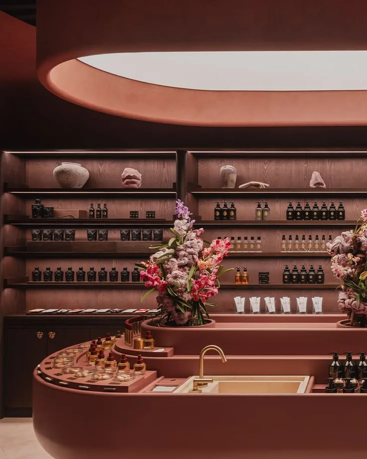
How to Maximize the Space Efficiency of Your Shop
[How to design for higher revenue per square metre in retail architecture]
In premium retail design, spatial efficiency is directly tied to your bottom line. Whether you are operating a boutique fashion atelier in Amsterdam’s Negen Straatjes or a specialty showroom in Utrecht, every square centimetre of floor space must actively generate financial value. Maximizing a compact retail layout isn't just about packing more inventory onto shelves; it is about using precise architectural zoning and custom infrastructure to change how the space flows. A truly efficient shop layout guides client behavior, eliminates operational friction, and elevates the perceived luxury of your brand by replacing physical clutter with calculated design symmetry.
At Atelier Niris, we approach commercial retail architecture by balancing visual minimalism with absolute functional performance. Here is our curated guide to modern design upgrades that systematically multiply the spatial efficiency and revenue density of your shop.
1. Monolithic Vertical Display
[Moving from freestanding racks to integrated architectural perimeters]
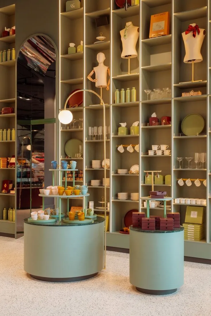
Using a messy mix of standalone clothing rails, heavy display tables, and separate shelving units is the biggest reason shops run out of room. These separate furniture pieces create awkward, dead corners, block natural light, and break up the floor into a chaotic layout that makes the boutique feel cramped. Investing in high-end, custom wall shelving allows you to reclaim your wall space. This changes your walls into clean, high-capacity display zones that keep the main floor completely open.
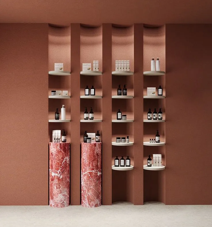
To get the most out of this setup, design custom cabinets that stretch all the way from the floor to the absolute highest point of the ceiling. By tucking clothing rods and adjustable display shelves directly into smooth wall panels painted in a matching color, your products appear to float right within the architecture. This layout draws the customer's eyes upward, making a compact boutique feel twice its actual size. Best of all, by building hidden storage cabinets directly into the lower base and upper sections of these custom walls, you eliminate the need for a massive, space-consuming backroom—allowing you to turn standard storage areas into highly valuable active selling space.
2. The Multi-Use Checkout Island
[Moving from bulky sales counters to streamlined multifunctional volumes]
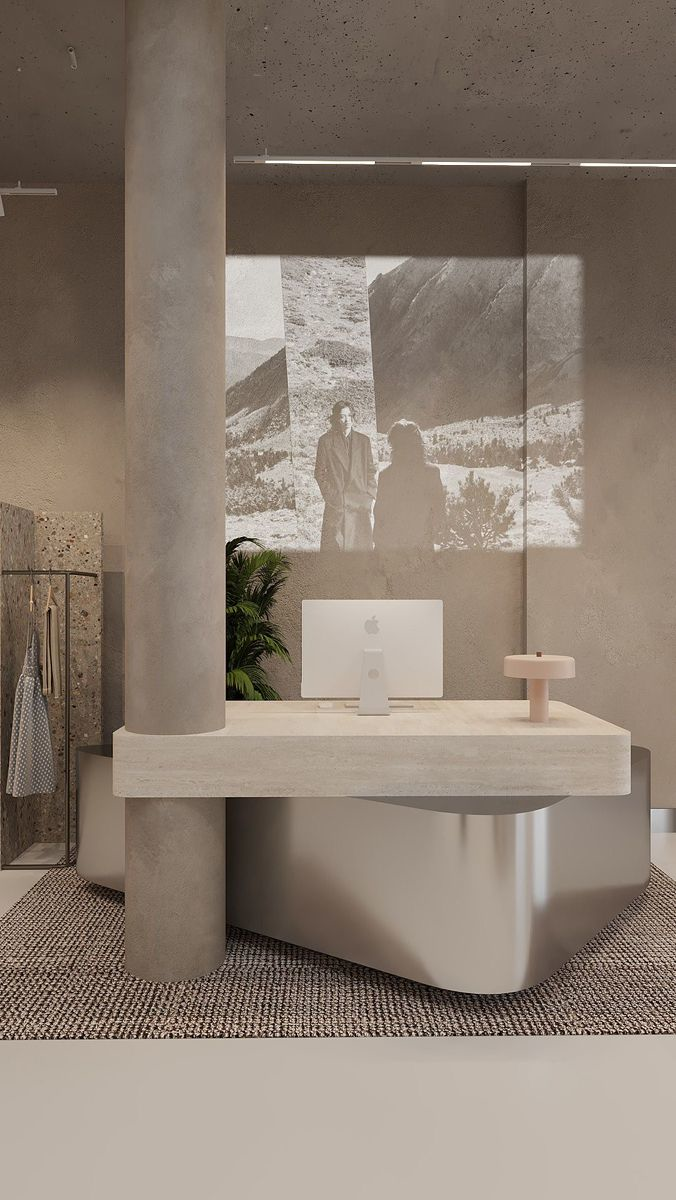
Oversized, traditional cash wrap counters are massive space killers in a compact shop layout. They take up prime real estate right in the middle or front of the boutique, create clunky physical boundaries, and quickly become a magnet for unsightly operational clutter like tissue paper, shopping bags, and loose receipts. To unlock maximum space efficiency, the checkout area must be treated as a streamlined, multi-use design element rather than a massive, permanent desk.
The solution is to design a sleek, custom service island that completely hides all the messy, functional elements of checking out. By building credit card terminals, hidden cable channels, and trash bins directly into a clean stone or wood counter, the cash wrap looks like a premium display piece rather than a corporate register. Elevate this design further by adding fold-away wrapping stations or slide-out drawers that tuck smoothly out of sight when you don't need them. This custom setup minimizes the counter's actual footprint, ensuring the checkout zone keeps the shop feeling open and luxurious while remaining highly organized.
3. Modular Display Blocks
[Moving from permanent floor obstacles to flexible spatial choreography]
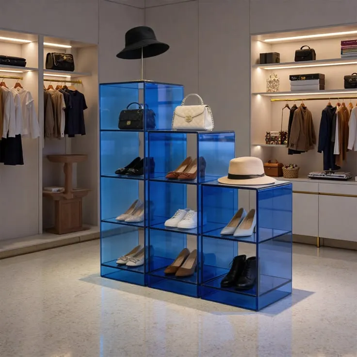
Placing heavy, immovable display tables or permanent clothing stands in the center of your shop creates rigid traffic bottlenecks. Consumer shopping behaviors, seasonal collection rotations, and in-store events require a floor plan that can adapt instantly. To maintain absolute space efficiency, your central floor fixtures must be designed as flexible, modular units that adapt to your inventory demands rather than forcing your inventory to adapt to them.
Instead of heavy static furniture, implement a system of custom-designed, modular display blocks or nested plinths finished in premium, authentic materials like natural stone or matte-finished European oak. These elements can be grouped together to form a large, striking sculptural centerpiece during high-inventory seasons, or completely separated and nested out of the way to clear the floor path for client events or peak weekend foot traffic. By keeping the heights variable and the footprints streamlined, you keep the visual sightlines across the shop entirely open. This flexibility ensures your floor space continuously generates maximum engagement without ever crowding the consumer’s path.
4. The Hidden Fitting Room
[Moving from dead single-use cubicles to dynamic styling volumes]
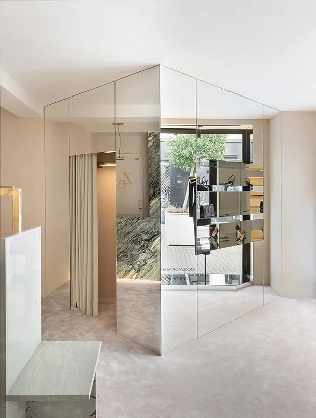
Traditional fitting rooms are notorious space drains in a compact boutique layout. They occupy prime square meterage, remain empty for a large portion of the trading day, and introduce heavy, closed-off walls that disrupt the open sightlines of the floor plan. To maximize retail space efficiency, changing zones must be approached as adaptive, multi-use architectural features that disappear seamlessly into the main sales floor when not actively in use.
Flush Wall Panelling (The Secret Door):
Instead of building permanent, drywall cubicles, engineer a styling alcove that completely blends into the perimeter architecture. By covering the entrance of the fitting nook with flush-mounted wooden wall panels that perfectly match the surrounding walls, the door becomes virtually invisible when closed, functioning just like a hidden built-in wardrobe.
Active Merchandising Contribution:
To make these essential square meters actively work for the shop when closed, the exterior face of the secret door can be fitted with a floor-to-ceiling premium mirror or minimal display shelving. When closed, it serves as a high-end visual asset that bounces natural light deep into the boutique, offers customers a place to view outfits, or showcases a highly curated capsule collection. When a client requires privacy, the panel swings open effortlessly to reveal the luxurious dressing sanctuary inside—ensuring zero wasted space throughout the trading day.
5. Using Lighting for Zoning Instead of Partitions
[Moving from physical layout barriers to invisible boundaries]
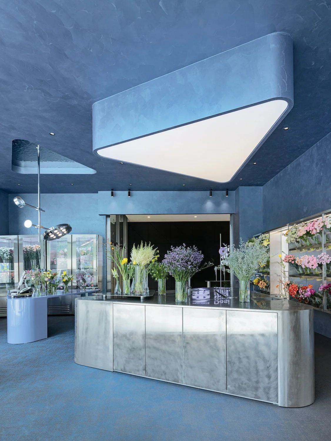
Dividing a small shop floor with solid walls, privacy screens, or heavy partitions is the fastest way to make the space feel cramped. Every extra wall cuts off natural light and blocks the customer's view of your products. To keep your shop highly efficient while still separating different product sections, you should replace physical barriers with calculated light zoning.
• Invisible Optical Boundaries: Instead of building walls to define sections, use custom light fixtures built directly into the smooth ceilings and walls. By mixing flush-mounted LED tracks, recessed spotlights, and hidden backdrop lighting, you can create distinct "rooms" using only light intensity. For example, a premium denim wall can be lit with bright, crisp directional beams, while a separate collection area transitions into a soft, warm glow.
• Zoning with Statement Pendants: You can beautifully ground a specific area—like a central display table or the checkout island—by dropping a low-hanging sculptural pendant light over it. The hanging fixture acts as a visual anchor. It draws the eye downward, creates a sense of intimacy, and immediately tells the customer they have entered a specific zone without a single physical wall blocking the view or cutting off daylight—keeping the entire floor open and maximized for sales.
6. Storefront Minimalism
[Moving from congested window barriers to open light portals]
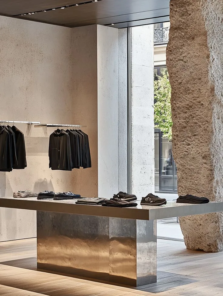
Stacking excessive merchandise, heavy signage, or dense product displays directly against your front window suffocates your shop's first impression. A cluttered storefront blocks natural daylight from entering the building and creates a physical wall that closes your business off from the streetscape. To achieve true spatial efficiency, your entryway must be treated as an open architectural portal that invites both light and clients inside.
The strategy is to keep the immediate interior perimeter behind your front windows entirely clear of dense, blocky fixtures. Instead, embrace an uncompromisingly minimalist presentation: display just one or two standout sculptural pieces or single sample products on low-profile, floating ledges. By removing high window backdrops and bulky barriers, you allow natural day-lit paths to cascade deep into the furthest corners of your layout. This openness erases the hard boundary between the outside world and your interior, instantly creating an airy, light-filled environment that makes a compact boutique feel double its actual size before a customer even steps inside.
7. Intelligent Mirror Placement and Reflective Expansion
[Moving from standard functional glass to strategic spatial multipliers]
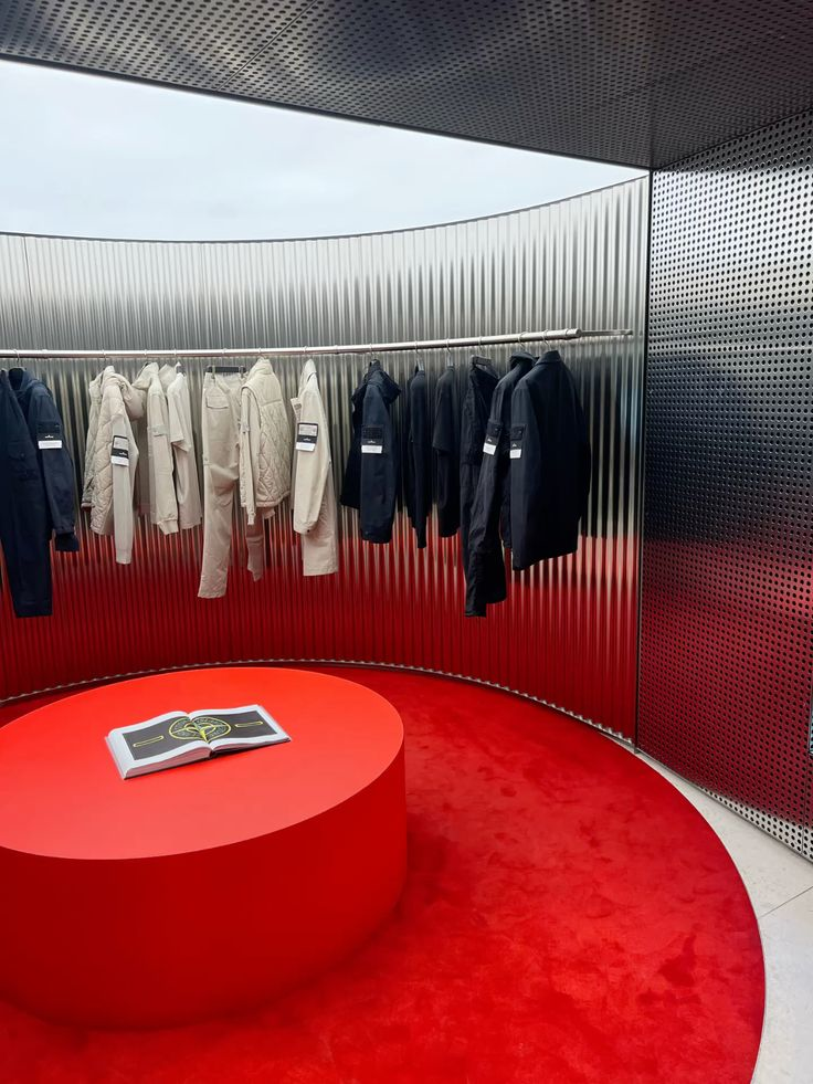
Simply hanging a standard mirror on a wall just so customers can view clothing is a missed opportunity for your layout. In a compact shop, a mirror should be treated as a strategic architectural tool that visually manipulates the size of the store. Without smart placement, your walls can feel tight, confining, and dark.
The strategy is to install floor-to-ceiling mirrored panels on the perimeter walls that run perpendicular to your main front windows. By placing high-quality, oversized mirrors at right angles to your natural light source, the glass catches the daylight and bounces it deep into the dark corners of the shop. This setup essentially creates an optical illusion that makes solid walls seem to vanish, creating the impression of a whole new room or an extended floor plan. This reflective design multiplies your visual volume and brightness completely hands-free, turning a small boutique footprint into an expansive, bright luxury environment.
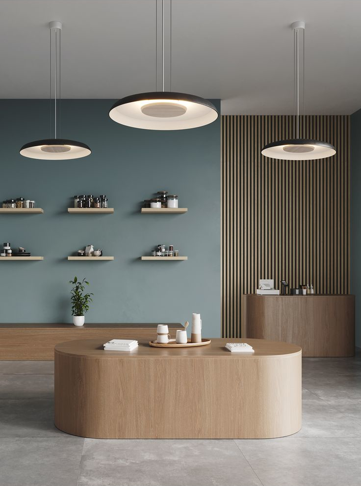
8. Cohesive Light Color Palettes
[Moving from broken color patches to boundless spatial volumes]
Using a chaotic mix of contrasting wall colors, bold accent paint, or dark partitions inside a compact shop cuts the room into tiny visual fragments. These harsh color changes act like stop signs for the customer’s eye, making the store feel small, busy, and enclosed.
The strategy is to implement a
continuous, light-diffusing color palette across all walls, ceilings, and built-in displays. By wrapping the boutique in high-end, soft neutral tones—
such as warm off-whites, pale silks, and muted stone greys—you create a low-contrast environment where hard corners and boundaries seem to dissolve. When the ceiling matches the walls perfectly, the human eye cannot easily pinpoint where the vertical space ends. This simple color strategy maximizes the natural light bouncing around the room, making a small shop footprint feel instantly open, calm, and grand.
9. The Showroom Model: Sample-Only Merchandising
[Moving from overcrowded sales floors to high-density inventory optimization]
Dumping your entire inventory directly onto the sales floor is the fastest way to turn a high-end boutique into a cluttered, overwhelming environment. Jamming every available size and color onto open display rails physically suffocates the layout, blocks natural daylight, and drastically cheapens the perceived luxury of your brand. To unlock maximum space efficiency, you must shift your operational strategy from a traditional warehouse layout to a high-conversion showroom model.
The strategy is to display only a single pristine sample of each product on the active sales floor, keeping the remaining sizes, colors, and stock variations meticulously organized inside a high-density back-of-house system. By clearing out duplicate inventory, you dramatically reduce the physical footprint required for displays, allowing you to keep the main shop floor beautifully open, minimalist, and calm. When a client selects a piece, staff retrieve the exact size and color variant from the hidden stockroom. This approach creates an exclusive, high-end hospitality flow that makes your shop feel like an airy gallery rather than a cramped stockyard.
10. High-Density Back-of-House Engineering
[Moving from chaotic storage rooms to streamlined logistical centers]
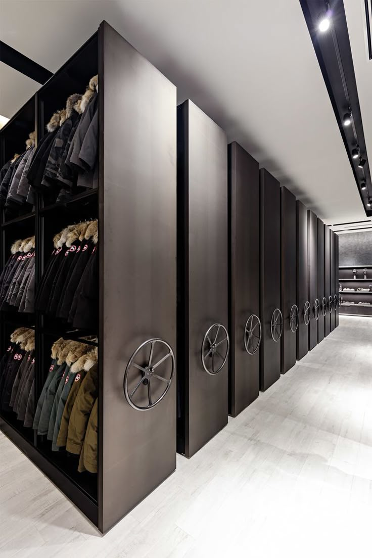
Adopting a sample-only showroom model works only if your back-of-house storage is running at absolute peak efficiency. In most small retail spaces, the stockroom is treated as a chaotic afterthought, filled with deep, static shelving units that leave massive amounts of vertical space completely wasted and force staff to spend valuable minutes searching for products.
To maximize your layout, you must structurally re-engineer this zone using vertical, high-density mobile shelving systems. By mounting custom storage racks onto floor tracks, you can completely eliminate the need for permanent walking aisles between every row of shelves. Instead, staff simply slide the units apart to create a single, moving aisle exactly where they need it. When you pair this mechanical layout with a strict, digital inventory system, you double the storage capacity of your existing backroom footprint. This high-efficiency engineering allows you to shrink your physical storage boundaries to the absolute minimum, freeing up highly valuable square meters that can be handed right back to the main sales floor to drive revenue.
Conclusion: Designing for Business Success
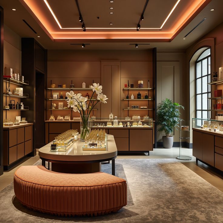
Turning a small shop into a highly profitable business comes down to one clear strategy: hiding the messy extra stock so your design can shine. When you swap out bulky standalone clothing racks for smart, built-in wall cabinets and hidden checkout counters, you unlock your shop's full potential without losing a high-end, luxurious feel.
By using clever layout paths, invisible light sections, and displaying only single product samples, a small footprint is completely transformed. These ideas prove that running a successful shop isn't about how many square meters you have—it is about how smartly your space handles light, movement, and layout, ensuring every single centimeter works hard to welcome your customers and grow your sales.
Why Partner with Atelier NIRIS?
[Moving from temporary decoration to smart retail layout]
In premium shop design, a beautiful and successful store is never an accident—it is always the direct result of mixing sustainability, bright natural light, and smart space planning. Buying temporary display furniture might offer a quick fix, but true, long-term business growth happens when you change the actual structure of your boutique.
By choosing design updates that lift shelves off the ground, blend messy checkout areas into the walls, and use smart lighting instead of solid barriers, you completely change how your store performs. Whether you are freeing up space with a hidden counter, opening paths with clear diagonal views, or smoothing your walls with soft, light-diffusing colors, you ensure your business stands far ahead of the competition. In the retail market, thoughtful layout architecture is your most powerful tool—ensuring every single square meter actively drives your business growth from the very moment a customer steps through the door.
Schedule your consultation
Do you want to know how to increase the space efficiency of your home?
See also:
Smart Design Ideas to Maximize Space in a Small House
Back to blogs